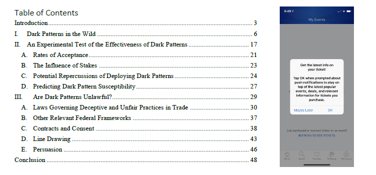
I discovered an interesting paper on dark patterns this morning: Shining a Light on Dark Patterns.
- By a former law school student (now an attorney) & a professor, about how companies are tricking online users, especially in e-commerce settings.
- They used HCI research and UX practitioner writings to come up with their own framework of dark patterns (see below).
- They then did a study where people got 1 of 3 versions of a system (control group/”light”, mildly dark, very dark).
- Their results: the very dark patterns indeed worked while causing participant backlash; the milder patterns worked but were less effective, with less backlash.
- The final part of the article is about the legal side and how governments might regulate this business practice.
Definitely the most interesting article by legal scholars I have ever seen!
I have to read it over more carefully later, especially to understand the study better and try to grok the legal stuff. More regulation of user interfaces is coming…
I did spend some time on their analysis of the HCI research and UX practitioner coverage of dark patterns to come up with their own taxonomy. Here is my version to help me make sense of it and find the reference material.
Nagging: Repeated requests to do something firm prefers [1]
Social Proof
- Activity messages: Misleading notice about other consumers’ actions [2]
- Testimonials: Misleading statements from customers [2]
Obstruction
- Roach Motel: Asymmetry between signing up and canceling [1, 2]
- Price Comparison Prevention: Frustrates comparison shopping [1, 2, 3]
- Intermediate Currency: Purchases in virtual currency to obscure cost [3]
Sneaking
- Sneak into Basket: Item consumer did not add is in cart [1, 2, 3]
- Hidden Costs: Costs obscured / disclosed late in transaction [1, 2, 3]
- Hidden subscription / forced continuity: Unanticipated / undesired automatic renewal [1, 2, 3]
- Bait & Switch: Customer sold something other than what’s originally advertised [1]
Interface Interference
- Hidden information / aesthetic manipulation / false hierarchy: Important information visually obscured [1, 2]
- Preselection: Firm-friendly default is preselected [1, 4]
- Toying with emotion: Emotionally manipulative framing [1]
- Trick questions: Intentional or obvious ambiguity [1, 2]
- Disguised Ad: Consumer induced to click on something that isn’t apparent ad [1, 3]
- Confirmshaming: Choice framed in way that seems dishonest / stupid [2, 3]
Forced Action (Forced Registration): Consumer tricked into thinking registration necessary [4]
Urgency
- Low stock / high-demand message: Consumer falsely informed of limited quantities [2]
- Countdown timer / Limited time message: Opportunity ends soon with blatant false visual cue [2]
References
[1] Colin M Gray et al., The Dark (Patterns) Side of UX Design
- ACM Digital Library, 2018 CHI Conference Proceedings
- ResearchGate
- Slides
- UX Pedagogy and Practice Lab (for more on the topic)
[2] Arunesh Mathur at al., Dark Patterns at Scale: Findings from a Crawl of 11K Shopping Websites
- Web site about the research (URL in paper does not work)
[3] Harry Brignull, Dark Patterns
[4] Christoph Bösch et al., Tales from the Dark Side: Privacy Dark Strategies and Privacy Dark Patterns
Also, the one source that jumped out at me that was missing: Evil by Design (57 more patterns to fold into the framework).

